
A genogram chart is a great way to show relationships between people. Mainly used by mental health experts, this diagram can help identify positive and negative influences surrounding a person. I found the genogram to be an excellent way to show your medical history. Some people like text, but I prefer a picture.
The genealogy, or medical history, genogram does not need the images to show behavior and influence used by mental health professionals and social workers.
The purpose of diagramming your medical history is to show what genetic traits may have been passed from one generation to the next… to show what conditions might affect you or your children. Many find a 1 or 2 page diagram easier to understand than your doctor's forms.
This is my only interest in the genogram chart. I am not a mental health professional. My original idea, and introduction to "drawing" my medical history came from Family Diseases – Are You At Risk? by Myra Vanderpool Gormley [Genealogical Publishing Company]. I recommend this book to anyone interested in their family medical history.
Getting started with genograms
You need to collect your genealogy and medical history notes about the person that you are planning to show, his or her spouse(s), children (if any), parents and grandparents. Medical history focuses on 3 to 4 generations so you aren't gathering information for hundreds of people.
What you need
You need the following information – or as much as you have – for each person:
- Name (first and last at the very least)
- Sex (male=square, female=circle; unknown=triangle)
- Birth date or year, even if it's approximate (example: c1900)
- Marriage date or each for each spouse, and date or year of divorce (if applicable)
- Date or year of death
- Cause of death
- Hereditary or potentially hereditary conditions
- Occupation (coal miner, train brakeman, etc are dangerous)
- Military service (camps are 'disease factories')
Don't get stuck in the details or organizing the information.
Draw the chart
When drawing a genogram diagram by hand, I use the following symbols. Most of the time, though, I use a software application.
| Symbol | Meaning |
|---|---|
   |
Male: (1) living; (2) dead; (3) stillborn |
   |
Female: (1) living; (2) dead; (3) stillborn |
   |
Unknown sex: (1) living; (2) dead; (3) stillborn |
 |
Married; male is always on the left and female always on the right for readability. |
 |
Living together but they were not married. |
 |
Separated or not living together. |
 |
Legally divorced. |
 |
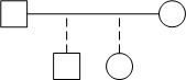
Biological children are connected to and descend from the marriage (or living together) line. Each child has a separate line – except twins, see below – and they are usually listed in the order of birth from oldest on the left and youngest to the right. The marriage / living together line should be stretched to include space for all of the children. A solid line between the parent(s) and child always means a genetic or blood relationship. |
  |
Fraternal twins connect to the marriage / living together line at the same point to show they were born at the same time. Fraternal twins are listed in order with the older twin on the left, if known. This symbol can be extended to show triplets, quads, quints, etc; just keep adding to the same point. |
  |
Identical twins are similar to fraternal twins but there is a line between the two children. Identical twins are listed in order with the older twin on the left, if known. |
 |
Adopted children are shown with a dashed line. A dashed line between the parent(s) and child always means a legal / adopted relationship. Foster children are shown with a dotted line, which (I guess) shows the relationship is not permanent. |
 Add the dates & ages
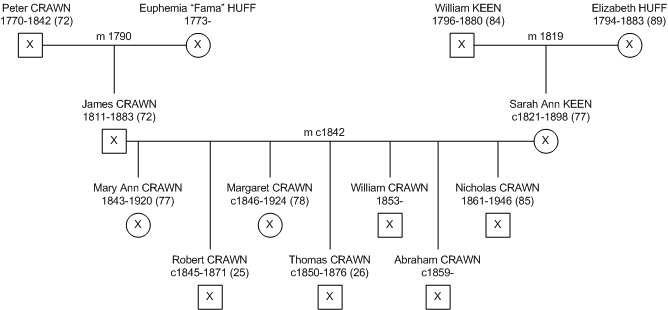
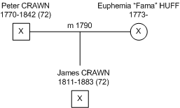
In the example at right, James CRAWN was born in 1811 and died in 1883 at the age of 72 (round it down).
His parents, Peter CRAWN and Euphemia "Fama" HUFF, were married in 1790. So we know they were married 21 years when James was born. Peter was 20 years old when they married and 41 when James was born. James' mother, Fama, was 17 when she married Peter and 37 when James was born.
They all have an "X" in the symbol because we're pretty sure they died a while ago. We just don't know when Fama died (yet).
This quick math is a 'sanity check' to make sure it is likely that James fits in this family. ALWAYS check the math.
Add cause of death
When you know the cause of death, add it to the diagram after the person's name or the year he or she died. You don't need to explain the back-story, just list the cause. If you don't know, leave it out. Examples might include:
|
|
Is there software to draw the diagram?
Yes. Many applications intended for sociologists, social workers, and other mental healthcare professionals can be very expensive. But, then, those applications are really intended for a different purpose. That is, mental health evaluations, counseling, etc.
I found and like GenoPro because it is easy to use and affordable. I do not receive any payment or support of any kind from the GenoPro folks. It's just the app I use. If you know of any other apps like it, let me know.